Sunday, April 27, 2008

Flavor Of Love


Today had been a very emotional day for our family. My husband has to fly to overseas for a short business trip for a week. Ryan had been so emotional and just couldn't take it. He missed his daddy from the moment his dad step out the door. This is a layout that he actually requested that I do it for him to dedicate it to his dad who I believe is still in the air. He hope that his daddy could see it when he is able to get online. He just wants his daddy to know how much he loves him and want him to come home soon.

The steps to this layout are as below.

1) I've layered a few pieces of pattern papers and later did some reverse masking of two big circles to create a more layered look.

2) All the pattern papers and the photographs had been distressed using the scissors technique.

3) I've used an alcohol inked glossy paper to stamped the flowers and flourishes and later cut it out to get the cool marble look on it.

4) The small piece of square on the upper right corner is actually an embossed card stock which had been inked with distress inks. To further distress it, I've also added some sprinkle of water on it.

5) I've hand drawn and cut out the huge "F' for the title and later painted and stamped on it. I've added some glossy accents to it to get a glossy dimensional look.

6) All the clock images are stamped. Two of them are stamped on grey crafting foam and another two on pattern paper and card stock. I've added a layer of white felt for the crafting foam clocks to give a softer look to it. The clocks actually resembles the time that Ryan has to wait for his dad to come home.

7) The journaling box are actually stamped and attached to the layout using foam adhesives for more dimension.

8) To finish up this layout, I've added some doodling and rub-ons all over it.

Sources: Card stock: Bazzill Basic Papers, Pattern Papers: Paper Pizazz, Ink: Ranger Alcohol Inks, Tim Holtz's Distress Ink, ColorBox, Staz On, Emboss It and Memories, Rub-ons: Heidi Grace, Stamps: Autumn Leaves, Impression Obsession, Norsk Stempelblad AS, Art Warehouse, Heidi Swapp, Brads: The Paper Studio, Queen&Co Others: Zig pens, uni-ball signo gel pen, acrylic paint, glossy accents (Ranger Ink).

Saturday, April 26, 2008

Stamp Directory


I've been busy trying to get all my clear and unmounted stamps organized last few days. I've put all my stamps into cd cases and labeled them accordingly. I love that idea but I think a better idea to search for your stamps would be to have a "stamp directory". I've tried stamping on papers and stick them onto the cd cases but I think it would take me sometime to pull each cd cases out and look at them. Therefore, I've came out with a "stamp directory". This will enable me to easily flip through them to search for a stamp for my project.


I've created this directory from scratch. I've used two pieces of chipboard for the covers and transparencies for the pages inside. (This is to ensure durability of the pages since it's going to be flip quite often.) For the front and back cover, I've layered a few pieces of pattern papers and a strip of lace with a ribbon in between the them. I've stamped a clock and embossed it. To add more dimensions and texture, I've used some chipboard pieces and a grungeboard alphabet for the title. The rest of the title are covered with crackle accents. For details on this page, I've doodled and done some masking on it. For softness, I've added some ribbons on the binder rings.


The pages inside are created out of transparencies. I've stamped the all the stamp images pertaining to each cd case in a small sheet of thin card stock and attached it to the transparency page. You can also used the printed images on plastic on it's packaging to attach it here to save some work. Later, just labeled each page according to the label on the cd cases.


This is a very time consuming project but I've had fun and think that it would help me to speed up my work in future. If you think that all this is a little time consuming to you, simply scan all the original images on the packaging and print it out. Put them into a clear file.

But for me, I think I just need to personalize my "stamp directory". Hope you all like this idea.

Wednesday, April 23, 2008

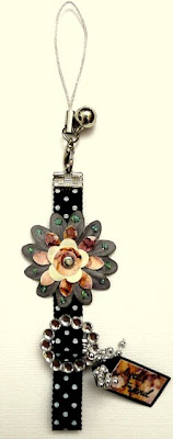
Sweet Friend Phone Strap


This is just a little altered phone strap that I've been having some fun doing today. I've used some of my scraps of alcohol inked paper to layer the flower and create a tag with it. It gives such a cool marble look and I love it. I've added some glitters using stickles and some crystals for bling.

I've created this for a very kind friend of mine. This is such a fun project and I think it won't be my only one. Hope you all like it!

Monday, April 21, 2008

Thoughts of You Card


This is just a card that I've created while having some fun with my alcohol inks. Here are the steps to this card.
1) First I've used some alcohol inks to create a stained glass pattern on a glossy photo paper. To create the pattern, you need to apply the alcohol inks onto the applicator and randomly stamped all over the paper. Then you apply some blending solution on the applicator and stamped on the paper again. I've actually created two tones of alcohol inked glossy paper for this card. The purple tone are created using wild plum, denim, butterscotch alcohol inks. The brown tone are created using butterscotch, oregano, expresso alcohol inks.
2) The cute image in this card is not a stamp I owned. It's a stamped image that a friend of mine had sent to me. I've used the purple tone alcohol inked paper and print the image on it using my printer.
3) I've also prepared a piece of white card stock and a smaller black card stock for this card. For the black card stock, I've pre-drawn a window with grills and cut it out.
4) I've cut the brown tones alcohol inked paper in small pieces and attached around the window opening with foam adhesives for dimension.
5) The flourishes are stamped and heat embossed using white embossing powder on a black card stock and later cut it out. I've added some glitters using stickles on the flowers to give a little bling to it.
6) For some softness, I've added some flowers and a ribbon strip on the bottom of the card.
7) I've attached the purple tone alcohol inked paper on the white card stock that I've prepared earlier. I've added a journaling box on it too.
8) I've attached the black window front card stock using an eyelet on the upper left corner of the card. This will enable the front of the card to flip side ways or up for the recipient to read the journaling inside. I've added some ribbons to it for some softness and colours.
9) Lastly, I've added some drops of 3dimensional accents all over the card. These will create rain drops all over the card.
This card is to create a view that the cute image is looking through her window to see the rain outside.
I've entered this card into a challenge held by a friend of mine, Ying. She is having a blog candy challenge. Do check out her blog on my list of blogs on the right if you're interested.
Sources: Card stock: Bazzill Basics Paper, ProvoCraft, Ink: Memories, Tim Holtz Distress Inks, Emboss It, Ranger Alcohol Inks and Staz On, Stamps/stamped image: Hanglar & Stanglar, Autumn Leaves, Inque Boutique, Brads: The Paper Studio, Others: uni-ball signo gel pen, stickles, ribbons, eyelet, flowers, embossing powder, glossy accents, alcohol ink blending solution (Ranger), glossy photo paper.

Friday, April 18, 2008

Brighten


This layout is about how Ryan's smile brightens our family everyday and that's the reason why I've named the layout "Brighten". The inspiration of the layout came to me while I was walking in the park one day and it just sparks to me that spring is not just about flowers, it's about leaves too. Therefore I would liked to create the layout using some leaves embellishment.

Here are the steps to this layout.

1) I've used the "Printing with Plastic Wrap" technique to give the background some depths and a more textured look.

2) I've created the strays of light by masking using a self made template and some distress ink.

3) The leaves are created using "Create Leaves using Alcohol Ink Treated Transparency" technique. I've cut part of the leaves and fold it up to give some dimensions to it.

4) All flourishes are stamped and heat embossed.

5) I've used some felt fusion and vellum to create the butterfly. To add some interest to it, I've added some bling using stickles and doodling.

This is such a fun layout to do and it's also my first experiment with alcohol inks. I will definitely be using it more in my upcoming projects.
Sources: Card stock: Bazzill Basic Papers, Pattern Papers: Basic Grey, Stamp it, Ink: Ranger Alcohol Inks, Tim Holtz's Distress Ink, ColorBox, Staz On, Emboss It and Memories, Rub-ons: Urban Lily, Stamps: Autumn Leaves, Impression Obsession, Norsk Stempelblad AS, Hampton Art, Art Warehouse, Chipboard: Heidi Swapp, Brads: The Paper Studio, Others: Zig pens, uni-ball signo gel pen, acrylic paint, crackle accents (Ranger Ink), stickles, transparency, felt fusion (Queen & Co).

Create Leaves using Alcohol Ink Treated Transparency

I was so excited to get to play with some alcohol inks when one of my friend sent me some to play with all the way from the states. I've had so much fun with it and I will still be experimenting more with it. This is just one of my first experiment with alcohol inks.

Here are the steps to create the leaves as above.

1) I've used two ways of applying alcohol inks to my transparency. I think It's called the "Polished Stone" technique.
The first technique that I've used is what I called the "drip on" method. Simply apply a few drops of a combinations of alcohol inks randomly on the transparency and later use the blending solution and do the same on top of it. The blending solution will create a very interesting design and colours to it. This will give you a more vibrant pattern.
The second technique that I've used is called the "felt" method. I've used the alcohol ink applicator with a felt end for this method. Just apply a few drips of alcohol inks onto the felt and start dabbing and rubbing randomly onto the transparency. Repeat with a few more other colours using the same felt. You will see that the pattern and colours is getting more and more interesting. Add some blending solution too to get an even amazing effect.

2) After the step above, simply just get some leaves stamps and start stamping on it. Then cut it out to be used in your projects.

I just love this technique and it gives such an interesting stained glass look embellishment.

Printing with Plastic Wrap

This is a technique which I've used to add some texture look to my layout titled "Brighten". Just dab some plastic wrap in paints and start printing randomly all over your card stock or pattern paper. Besides texture, it also gives a distressed look to it. Try it with more than one colour and you will get more depth in your background.

Tuesday, April 15, 2008

Best Friends Card


This is a card that I've created for a new friend of mine. She had sent me lots of stamps all the way from Norway. Therefore, I've tried to use some of the stamps that she had sent me in this card for her.
Among her stamps, there are some images stamps which I think most crafters would not have an idea how to use it. Therefore, I tried to use them in creating this card, hoping to inspire anyone who also love these stamps.
Here are the steps to this card.
1) I've created a blue and green gesso distressed background using gesso and some distress ink. Then I've stamped a journaling stamp using the frayed burlap distress ink before stamping the image over it using black solvent ink.
2) For the top image, I've stamped a journaling stamp in white pigment ink and later stamped and heat embossed the image using some white embossing powder.
3) Later, I've cut both stamped pieces in strips and arranged them in a way that they are overlapped. I've attached some of the strips using foam adhesives to create a little dimensions for the card.
4) As for the inside of the card, I've used another two images stamps and some platinum pigment ink to stamp on it. I've also stamped and heat embossed some flourishes too.
This is a very fun experiment for me and it's all thanks to Aashild!! I hope you like this card!
Sources: Card stock: Bazzill Basics Paper, Ink: Memories, ColorBox, Tim Holtz Distress Inks, Emboss It and Staz On, Stamps: Norsk Stempelblad AS, Brads: The Paper Studio, Others: uni-ball signo gel pen, cord, embossing powder.

Sunday, April 13, 2008

Thank You Card


Here's a card which I've created using one of the cute Hanglar stamp that a great friend had sent me as a challenge. Thanks Tesa!!

Well, honestly speaking, it is a challenge to me to use this stamp. She wanted something different than the norm. Therefore, I've came up with a few techniques in this card while experimenting with it.

This is a hidden flap open card. These are the steps to this card.

1) I've used the "Mesh Printing with Gesso" technique to create the distressed background and I've used the scissors distressing technique on the edges of that background.

2) I've stamped two images of that cute stamp on it and I've also used the "Using Colours from Magazine" technique to create another of that same cute image. To add some colours onto the first image, I've stamped the cute image on a pattern paper and later cut parts of it out. I've used some foam adhesives to add dimensions to it.

3) I've stamped a border on a white card stock and later cut it out to be attached to the card. To add some softness to the card, I've added the ribbons to it and a cord to secure the flap. I've used a metal hinge to create the open flap.

4) I've stamped and heat embossed the butterfly and the title. I've cut out the butterfly and folded it for a more dimensional look.

5) Lastly, for the inside of the card, I've stenciled an oval shape using some distress ink and stamped a journal box on it.

Tesa, I hope I've not let you down. Well, I will be experimenting with this stamp some more and perhaps will come up with some other projects and techniques! Thanks for the challenge and this card is for you!! Hugs!!

Sources: Card stock: Bazzill Basics Paper, ProvoCraft, Ink: Memories, Tim Holtz Distress Inks, Emboss It and Staz On, Stamps: Norsk Stempelblad AS, Hanglar & Stanglar, DMD, Stampin' Up, Hero Arts, Brads: The Paper Studio, Others: uni-ball signo gel pen, glitters, rhinestones, ribbons, cords, eyelets, flower, embossing powder, metal hinge.

LinkWithin

Blog Widget by LinkWithin