Friday, June 27, 2008

Friendship Blossoms Through Time ATCs


This is a set of ATCs that I've created for a swap with a very talented friend of mine from Norway. I want to make these ATCs to be special and carries meaning in them. (Just liked what I would do when I scrap a layout)

From the title above, you would have guessed that the meaning in each ATCs makes up a message or saying. I will explain each and everyone of them in detail.

Friendship ATC:
1) I've distressed the edges of the base card stock here using the scissors technique and inked it with distress ink. I've used a circle pattern paper to layer it and stamped some words on it using distress ink too.
2) I've masked a flower and doodled on it using a white gel pen and stamped some bubbles and heat embossed it using some embossing powder. I've also covered it with some glossy accents for dimension. (This resembles the sweetness in a 'Friendship")
3) I've torn part of the card and stitched on it. (This resembles the bitterness in every friendship. It's always never too late for us to try to mend it.)
4) I've used an image of two little girls walking together to resemble the word "friendship".
5) The frame of the title is stamped and heat embossed using gold embossing powder. The title is hand written using white gel pen.
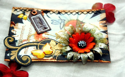
Blossoms ATC:


1) I've distressed the edges of the base card stock here using the scissors technique and inked it with distress ink. Then, I've printed a picture of some daisies to layer on it.
2) The flower is created using the "Alcohol Inked Vellum Flowers" technique. I've also added some glitters on it for some bling. I've also added some butterflies stickers on the ATC. (This resembles the word "Blossoms")
3) The flourishes had been stamped and heat embossed on a black card stock and later cut it out to attach to the ATC.
4) I've added a row of stitching on the right border and included a small tag for the title. I've also added some crackle accents to the tag for some dimensions.
Through ATC:


1) To resemble the word "Through", I've used a transparency for the base of this ATC. I've used a picture of me to layer behind the transparency.

2) I've also added a piece of pattern paper which I've distressed using the scissors, inking and masking technique behind my picture.

3) I've randomly stamped some flowers using a white solvent ink all over the transparency.

4) To stamped the scrollies on the transparency, I've used a black solvent ink. I've also added some glitters to it.

5) I've used some mini brads to attach the piece which contain my picture to the transparency.

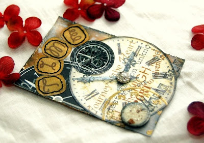
Time ATC:


1) I've used many clock images here to resemble the word "Time".

2) The base of this ATC is created using a card stock which I've used the
"Gesso Distressing" technique to distress it.

3) For dimensions, I've added a chipboard circle which I've covered with handmade paper and crackle accents.

4) I've also stamped and heat embossed a clock on the lower left corner of the ATC.

5) The title are actually alpha stickers where I've added details to it by inking and stitching on it.

I really hope she likes this set of ATCs that I've created for her and the "saying" that comes with it will be true for our friendship.

Sources: Card stock: Bazzill Basic; Pattern Paper: Hot Off The Press (Paper Pizazz), Provo Craft; Ink: Ranger Distress Ink, Ranger Emboss It, Ranger Adirondack, Ranger Alcohol Ink, Ranger Blending Solution, Tsukineko Staz On; Stamps: Autumn Leaves, Hampton Art, Heidi Swapp; Others: Glitters (Ranger Stickles), Ranger Inkssentials Crackle Accents, Ranger Inkssentials Glossy Accents, Ranger Alcohol Ink Applicator, Zig pens, Uni-ball Signo Gel Pen, transparency, eyelet, brads.

Reverse Look of The Bubble Wrapper Printing

I've also received a few emails regarding this technique as I did not shared it in detail in a few of my recent work. So here it is.

1) Prepare a piece of pattern paper or card stock and a hole puncher.


2) Fold the paper or card stock in layers and start punching holes randomly all over the paper. (To create a more interesting pattern, try using various sizes of hole punchers.)


3) Open up the paper to reveal the holes pattern created. (Kinda liked the "Reverse Look of The Bubble Wrapper Printing" when it's layered against a background card stock or pattern paper.)


4) Tear off the straight edges of the paper or the card stock to distress it and inked it with distress ink. You could also be more adventurous and heat embossed the edges. Creativity is endless here.

Isn't this the easiest technique or what? I bet everyone could do this!

Alcohol Inked Vellum Flowers


I've actually received a few emails asking me regarding this technique. Therefore I'm going to post it separately in my tips and tricks section.

Here are the steps to creating an alcohol inked vellum flower.
1) Choose a few colours of alcohol inks, a mixatives (silver/gold) and blending solution.

2) Apply those inks on an alcohol ink applicator. You can mixed all the colours on the applicator and use it to stamp onto a sheet of vellum at the same time. You don't need to do one colour at a time. Try to stamp the vellum in layers. This will create a better marbled look to it. You can add some blending solution to your applicator and stamp on it too.

3) Then apply some mixatives (use only one to three drops as it's very concentrated) using the applicator too.

4) When the vellum is dry, flip it over and trace or draw a flower pattern on it. (I've not created these patterns myself) They are either trace from some prima flowers or some chipboard flowers that I have and I've added a little alterations on my end.

5) To create dimensions for these flowers, use a tip of a small scissors or a twizzer and use it to bend and pull under each petal. Do this from the middle of the flower to tip of the petal. Then you will notice that the petals are all curled downwards.

6) Fold each petal upwards towards the middle of the flower. Now, you will see that the form of the flowers would be as the pictures above.

7) Lastly, ink the edges of the flowers with distress inks and you could also create some dew drops by following the
"Freshen Up your Flowers" technique.

Wednesday, June 25, 2008

Princess


Here's a layout that I've created for a contest at Serendipity.com. It's a challenge on using Ranger/Tim Holtz's products. As most of you might know, I'm a big fan of these products and can't simply control myself to give this contest a try.
The story behind this layout is about how much Chloe had been a "princess" in our family's life. She is a princess that is always looking forward to grow up fast. This can be resemble by the big bloom that she is looking upon.
Here are the steps to it.
1) I've not used any pattern paper here. I've only used card stocks and inks to create all the layers here. I've used lots of distress inks (Ranger Tim Holtz Distress Inks ~ shabby shutters, black soot, peeled paint, frayed burlap, old paper, tattered rose, fired bricks) on this layout.
2) The strip on the left of the layout is creating using the "Water Distressing" technique.
3) I've masked the two layers underneath the photograph and also added a layer of "the reverse look of bubble wrapper painting" there. For some journaling, I've added a tag underneath the photograph too.
4) The flourishes border on the left of the photograph had been stamped using embossing ink (Ranger Emboss It) and heat embossed using some gold embossing powders (Ranger Embossing Pearls ~ silver) on black card stock. I've added some glitters (Ranger Stickles ~ gold) for details.
5) I've used the "Gesso Distressing" technique on the bottom of the layout.
6) The "O" on the left of the layout had been painted with acrylic paint ( Ranger Acrylic Paint Dabber) and stamped on using some dye ink (Ranger Adirondack Ink Pad ~ Pitch Black).
7) The crown/tiara are actually a grungeboard (Tim Holtz Idea-ology Element~harlequin) that I've inked with distress ink (Ranger Tim Holtz Distress Ink ~ Fired Brick, Aged Mahogany, Black Soot) )and added some crackle accents (Ranger Inkssentials Crackle Accents) on it. I've also added some beads and crystals for details.
8) The transparent flowers are created using transparency which I've cut out the layers and paint on the edges using acrylic paints and doodled dots to it.
9) The red and green flowers are actually alcohol inked vellum. I've used various alcohol inks from Ranger (cranberry, meadow, oregano, expresso, butterscotch, silver mixatives, blending solution) to stamped (Ranger Alcohol Ink Applicator) on a white vellum and later cut the flowers using it. I've used some glossy accents (Ranger Inkssentials Glossy Accents) to create the dew drops using the "Freshen Up your Flowers" technique.

I'm always inspired by lots of products from Ranger and Tim Holtz. Hope you all like this.
Sources: Card stock: Bazzill Basic; Ink: Ranger Distress Ink, Ranger Emboss It, Ranger Adirondack, Ranger Alcohol Ink, Ranger Blending Solution; Stamps: Autumn Leaves and Prima Marketing; Rub-Ons: Basic Grey; Others: Glitters (Ranger Stickles), Ranger Inkssentials Crackle Accents, Ranger Inksssentials Glossy Accents, Ranger Alcohol Ink Applicator, Zig pens, Uni-ball Signo Gel Pen, ribbon, chipboard(Basic Grey), acrylic paints (Ranger Acrylic Paint Dabber and Making Memories), grungeboard (Tim Holtz Idea-ology), eyelets, brads, crystals, beads.
Note:
By the way, I've some readers who actually emailed me asking me about having a subscription tool on my blog. I've actually added that now and hope that this will ease some of you in checking out my latest news or work. I don't know if it works or not. If you have any problems at all, do let me know.

Saturday, June 21, 2008

UR My Sunshine


This is another layout on Ryan. I've tried the groovy doodling technique in this layout. The title is definitely inspired by his looks in the photograph. Don't you think he just shines there. So with the word "sunshine" to resembles "son shines", there goes my title.

Here are the steps to it.

1) Firstly, I've masked various semi circles on the right border of the page and doodled some groovy semi circles on it.

2) The white layer in the center is a handmade paper from DMD which I've torn the edges and stitched it down to the page.

3) I've distressed the photograph using the scissors technique.

4) I've added some masking of numbers behind the photograph. I've used the number 1 to 5 since Ryan is about 5 now.

5) I've also masked a huge circle around the photograph and stitched another circles overlapping it. To add more layers, I've doodled a circle on a white card stock and cut it out to layer on top of the photograph.

6) All the stars are mainly chipboard and grungeboard. For the chipboard stars, I've covered them with various pattern papers or painted them. I've added some glossy accents to the white coloured stars. I've also added some grungeboard stars which I've inked and added glossy accents on the swirls.

7) I've masked a small white circle to write part of my title. I've used a foam circle to outline the circle too.

8) I've hand drawn the word "sunshine" to create the "ghost" letter effect so as not to block out the masked numbers behind it.
This is such a fun layout and it's also my first time in doing some groovy doodling. I love the effect and I think it's awesome for a boy's page.

Sources: Card stock: Bazzill Basic; Pattern Papers: Basic Grey, DMD, Hot Off The Press (Paper Pizazz); Ink: Ranger Distress Ink, Tsukineko Staz On, Hampton Art Doodlebug; Rub-Ons: Urban Lily; Others: Zig pens, Uni-ball Signo Gel Pen, Glossy accents (Ranger), buttons, chipboard (Fancy Pants), acrylic paints (Making Memories), grungeboard.

LinkWithin

Blog Widget by LinkWithin