Wednesday, February 28, 2007

Summary of Disneyland & Disney California Adventure


This is a layout about the summary of Disneyland and Disney California Adventure. Every time, when we visited a park, we normally get a copy of the route map. It is such a waste to throw it away. It is so informative. Therefore, for this layout, I've made a side inserting pocket to keep the route map. I've even use d the tickets to embellish the page.

Disney Downtown

This is a layout on the photographs taken at Disney Downtown. I've made this paper flower by just cutting it out, scoring it and dusting it with chalk.

Brother Bear

I've used some natural earth tones for this page on the movie "Brother Bear". Some fake stitching are done here using some acid free pens.

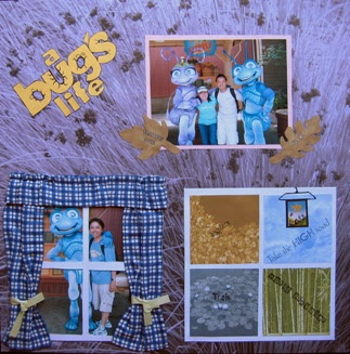
A bug's Life

This page is about characters in the movie "A bug's Life" The thought of window views just came to my mind at that time. Therefore, I've created fake windows using some sample squares of photographed papers and a little sewing.

Disney characters

In this layout, I've divided the page into three to display the three different characters. Paper piecing came in handy here.

Disney California Adventure

This is a layout about our visit to Disney California Adventure. I wanted to make a picture pile layout for this page therefore, I've used the folding method to make a board for inserting photographs and arrange them in pile.

Disneyland - Toys Story

A page about the characters in Toys Story 2. I've paper pieced bullseye for this page to get the cowboy looked. It's a very simple page.

Disneyland - Peter Pan & Lion King

This page is about Peter Pan and The Lion King cartoon characters. I've crumpled some map patterned papers and inked it to make it looked liked an old map. I've hidden the raw edges of the slab papers using strips of papers and ribbon.

Disneyland - Belle & Mulan

Of course, you can't miss out on Belle and Mulan for the Disney's princesses collection. Again I've divided the page into two. I've chosen some matching slab papers to used for the background. I've done some paper piecing of Mushu and some bamboo trees here.

Disneyland - Sleeping Beauty & Cinderella

Yet another Disney's princesses page. However for his page I've divided it into two again and I've used Disney's stickers instead of papers. This will safe space and make the page looked more complete. Furthermore, by doing this you can safe pages of your acid free scrapbooking albums and also make them less bulky. I've used some 6 x 6inch slab papers to create the different background for the two different themes.

Disneyland - Aladdin

One more page about Disney's princesses and prince. This page is about Aladdin and Princess Jasmine. I've used the same patterned paper to mat and to create tags. This will make them looked liked they are a set. The diamond shape papers used here reminds me of Agra, the place where the story of Aladdin begins.

Disneyland - Snow White

We also took some photographs with the Disney's princesses. This page is about Snow White. See how the Disney's theme papers came in handy here. It really helps to fill up the page since not much journalling can be done here.

Disneyland - Pinnochio & Alice

Photographs about cartoon characters can sometimes be very still and seldom we have a lot of stories about it, therefore not much journalling. In this layout, I've decided to divide the page into two, to let me fully utilized the space.

Disneyland - Hundred Acres Wood

The Hundred Acres Woods consists of Winnie the Pooh family. I had a strong urge of paper piecing Piglet for this page as we did not get to take a photograph with him. The series of Winnie the Pooh reminds me of honey in the bee hives all the time.

Disneyland - Toon Town

This page is about Disneyland Toon Town. The place is very colourful therefore I've wanted to create a very colourful page for the photographs. For this page, I've added in a feminine element such as beads.

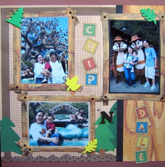
Disneyland - Chip "N" Dale

For this page on Chip "N" Dale, I've decided to create the woods looked. Using some distress ink on the edge of cut outs can sometimes make it looked woody. And brads can be used as nails. Don't throw away your alphabet sticker borders. I've used them here to add some colours to the page.

Disneyland - Goofy

I've decided to make this page looked fun and colourful since this is Goofy's personalities. I've also stamped my own background paper. The colour used here is basically colours from Goofy's clothes. The spiral and question mark cut outs add some silliness and goofiness for this page. Free hand cut outs saves you money from buying the cut outs machine or tools.

Disneyland - Donald

Donald Duck is another character that you don't want to miss at Disneyland and Disney California Adventure. I've stamped my own background here and mat it using a blue design paper. The used of a few sailor related embellishment further shows Donald's personalities.

Disneyland - Minnie

Besides Mickey, there are also other cartoon characters that we've taken photographs with. Disney's papers do actually came in very useful here. The polka dots of the paper ties in with the dress and ribbon bow that Minnie is wearing. The idea for this page is from an advertisement in the Creating Keepsakes magazine.

Tuesday, February 27, 2007

Disneyland - Mickey & Pluto

Visiting Mickey is a must at Disneyland. The idea for this page is from an advertisement published in the Creating Keepsakes magazine. You can get the Disney's stickers from http://scrapbook.sandylion.com or you can make it yourself. It is easy, just use some colour card stock or paper to cut them out and mat them in two or three layers.

Disneyland (Main Street)


Disneyland is a place where we find our childhood fantasies.It is definitely a great place to visit even though you are 80 years old. The idea of a bulletin board just came to my mind at that moment. Therefore, I've faked the looked in this two page layout. You can get all these Disney's papers from http:// scrapbook.sandylion.com or if you are in Malaysia, you might be able to get it at http://www.smidapaper.com .

Las Vegas


Las Vegas is a place you don't want to miss if you visit USA. I just can't stop taking photographs of all the beautiful hotels/casino. So many photographs to include. Therefore, a two page layout is necessary here. Dividing the page using blocking technique is very useful in this case.

Sea World


This is a four page layout about our day at Sea World, San Diego. The ideas for these pages are waves and bubbles. The colour blue actually ties all the photographs together. I included the map of Sea World in the layout by changing the opposite side of the map into layouts too.

Hollywood


This is also a two page layout about our trip to Hollywood. Using the grid looked display here are very suitable to put photographs of the wax statues that we took when we visited the museum. The colours used here made the pages looked elegant.

Santa Monica


Looking at the beach at Santa Monica inspired me to create this page. I wanted a beach looked page therefore I've used the colours of a beach. It makes the two page layout looked more suitable for the photographs. The idea for the layout is from a scrapbooking magazine.

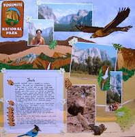
Yosemite


This is a two page layout of our trip to Yosemite National Park. Creating a paper piecing background is fun here. This will allow me to put all the animal stickers more naturally. It looks liked we have a Yosemite background for the Yosemite photographs.

Sacramento

This page is about a trip we made to Sacramento. We went to the Sacramento Old Town and California State Historical Capital. Sometimes, alphabets ascents can be made simply by stamping the alphabets onto coloured card stocks and cut them out in squares or circles.

Sunday, February 25, 2007

Bro & Sis

I've tried to use some neutral and earth tones in this page. The idea for the journalling is from Feb 2005 issue of Creating Keepsakes magazine. The watermark "&" behind the journalling is done using the Microsoft Office Word 2003. To create the photo border beside the journalling, simply use packing tape transfer. Cover "copied photographs" with packing tape and soak the taped image in water. Later remove from water and gently rub off paper from packing tape using fingers or anything you can find. (method from Mar 2005 issue of Memory Makers magazine)

Sweet delicious

Ryan loves smoothies especially strawberry smoothies. The idea for this page is from Feb 2005 issue of Creating Keepsakes magazine. Dare to use photographed papers in your page to complete the geometrical look. By using the Picasa software, I'm able to create the sweet looked in the photographs. Little embellishment using linen flowers complete the page. The fonts used in this page are downloaded free from a few website such as http://www.highfonts.com, http://www.1001fonts.com, http://www.dafont.com, http://www.acidfonts.com, http://www.1001freefonts.com, http://www.searchfreefonts.com and http://www.scrapvillage.com. Sometimes using different font styles in a page will draw attentions better.

Favourite Thing

Ryan loves to read and I can't stop thinking about making a page about it. I had taken photographs of Ryan reading from various different angles and cut them to change its focal point. I wanted this page to be of Ryan reading and nothing else therefore I had used the photographs as the ascents too. The idea for this page is from Sept 2005 issue of Creating Keepsakes magazine. Scrapbooking magazines really gives a lot of ideas and I advise all scrapbookers to get some magazines every once awhile. They really helps.

First day of school

It's now time for Ryan to go to nursery. It's his first day of school. The idea for this page is from Jan/Feb 2005 issue of Simple Scrapbooks magazine. The used of a few bright colour blocking gives the page a fresh looked which tie to the meaning of a new beginning.

MP3

The MP3 player is Ryan's Christmas present. He loves the MP3 player so much that he listens to it almost everyday. The idea for this page is from John Mayer's CD album cover. I liked the design so much, therefore I tried to use partially of it for this page. It gives a digital feel to it.

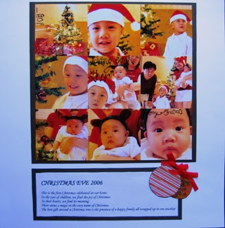
Christmas eve 2006

I had took a lot of photographs during the Christmas eve 2006. I wanted to include most of them in my page. Therefore, I've used the Picasa software (http://picasa.google.com) to create this collage. Try to crop your photographs to your desired focal point before you collage.

Ferry ride

This is the first time for Ryan to take the ferry ride. I've decided to use the photograph of a ferry as the focal point. This would directly explained the page. The big words in the page draws your view directly to them and could make the page looked complete.

Big Three

Ryan hits the big three. One of the layout in the Creating Keepsakes magazine had inspired me for this page. The random number "3" really tells the story of the page. Some paper piecing can be very decorative too. Cut your photographs to tell the story better.

Bicycle

I've done some mosaic for this page by using paint colours sample cards. Ive used all colours that I can find in the photographs to create the mosaic except orange. I wanted to add a colour that could make the page punched. I've used some toy tires to make the track prints on the page.

Time for fun

Ryan is about two and a half. He is able to swim freely using to arm floaters now. The smiles on his face really melts your heart. The photographs taken during a morning swim where there are indirect sunlight. I've cut out some circles from a design paper, and some wordings on vellum to decorate it. The idea for the big circle in the middle is from June 2005 issue Creating Keepsakes magazine. Some sewing had been done here.

Autumn

Autumn is here. What's more fun to Ryan playing in a pile of leaves. I wanted to create a page that is simple yet artistic and have the contrast looked. The colours of autumn inspired me and using a black and white photograph in the middle ties up the contrast colour of the two halves in the page. Dare to use free-hand writing as it shows personalities.
I am two

Ryan is two and this is a page about him and his birthday cake. The idea for this page is from June 2005 issue Creating Keepsakes magazine. Once again, cutting out big alphabets from scraps papers are very useful here. It adds as an ascent for the page. Be brave and dare to cut your photographs even though it does not make sense. You will see that it is very interesting. Sometimes, your photographs does not focus in the middle, therefore cutting it would solved the problem.

Horse Ride

It is very interesting to see how your kid reacts when he had his first horse ride. I wanted to create a simple page therefore I've used some colourful uneven stripes papers to create an ascent for the page. The colours of the stripes should coordinate with the colours of the whole page.

LinkWithin

Blog Widget by LinkWithin