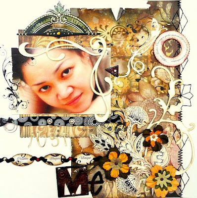


 This is my latest "me" layout which I've created for a challenge. The rules is to create a layout to brag about yourself. I must say this is difficult as I think not everyone could brag about themselves easily...lol! Anyway, due to this, I've kept my journaling very simple. This layout is fully inspired by my favourite colour and "me".
Here are the steps to it.
1) First of all, I've created a piece of water distressed pattern paper using the "Water Distressing" technique.
2) I've also cut out a strip pf flowers and flourishes from one of my Basic Grey pattern paper to layer on the right side of the layout.
3) I've used the "Be Bold in your Stitching" technique to stitch some designs for the border on the right side of the layout.
4) I've used another piece of pattern paper to layer my photograph and for balancing, I've added a stamped and coloured image on the top and a strip of ribbon on the bottom. For details, I've added white doodling, crystals, stitching and some rub-ons around my photograph.
5) I've actually used some cricut cut-outs (butterfly, swirls, alphas and flourishes) which I've gotten from a very kind friend of mine (Thanks Jamie!) to frame the photograph and layer behind the flowers and flourishes. It's amazing how these cutting machines could do.
6) I've stamped and cut out and inked the flowers and flourishes on the lower right of the page. I've also added some glitters to it for some bling.
7) The chain of words on the bottom left are fully created out of scraps. I've used some chipboard and cut them into ovals for the words and punch holes on both ends of it to thread the rick racks through. Then I've used some mini brads to attach it to the layout.
8) I've also used some grungeboard alphas which I've inked and covered with some crackle accents.
9) I've also added a quote in circular on the upper right of the layout.
I must say this is a very "Me" layout and I enjoy every moment creating it! Hope you all like it!
Sources: Card stock: Bazzill Basic Papers, Pattern Papers: Basic Grey, Ink: Tim Holtz's Distress Ink, Staz On, Stamps: Autumn Leaves, Making Memories, Impression Obsession, Rub-ons: Basic Grey, Brads: MakingMemories, Others: Prima flowers, Thickers (American Crafts), Zig pens, uni-ball signo gel pen, grungeboard, glitters (Stickles), Crackle accents (Ranger), crystals.

11 comments:
Hello again!
I told you before that I was longing to get my Norwegian magazine and to see your works. And it was so nice to get it in hands so I could get a closer study. Your works are so full of nice details and you are using "my" colours, so it goes straight into my heart. And it was nice to read the long interwiew with you. Soon I will try to make something something with the inspiration I `m getting from your art! Have a nice day!
Amazing!!!!
gorgeous layout!
I was in brousing the gallery at the veggie site and I knew right away that this was your lay out, you are truley a talent and have a style of your own...love your work....
this is just beautiful Irene, I espeically love your photo on this lo! it is just beautiful and your lo compliments it so nicely! I love all the depth here and the thing that is stitched right above your pic is awesome, I am not sure if that is made out of grungboard or if it is something more unique... love all your stitching down the right side and of course you masking and doodling always rocks firend!
Your work is breathtakingly beautiful. WOW! All I can say is WOW! Thanks for sharing your talent. :0)
You are a true artist!!! I am such a fan of your work!
Amazing!! This is "so" you!!
So beautiful, Irene. What a lovely layout!
So beautiful, my dear.
Your LO really not easy to scraplift (LOL)
the detail on this is mind blowing love it
Post a Comment